ZAPstract - art that zaps!

Tag Archives for: Review

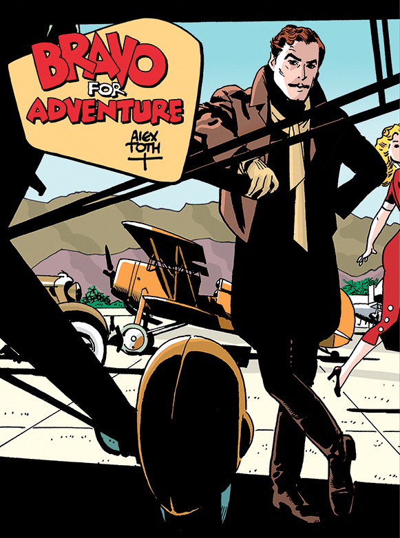
Anthony Trollope’s Bittersweet Gem

26 December 2021 by Rey Armenteros

The Warden by Anthony Trollope was on a shelf in a used bookstore, years back when I was living in another country and not expecting to find such a thing. It was the only used bookstore I knew that had a small section for English books. I had been curious about Trollope, but I had all this other stuff to read and decided not to get it then. I might have thought about Trollope from time to time since then; he was one of those authors I felt I was going to read one day.

Then, I got into a shopping binge a few years back. I would go through cycles of themes and purchase everything I could that I felt was related to that theme. It started with art books. My collection of art books at the time was pathetic, and I was trying to remedy that. I did remedy it and went on to other things. I kid you not that every type of literature that could occur to me went through a reassessment, and I found that I had to own some of it, regardless if I had read it before or planned on reading it soon. I found The Warden online and bought it and two other Trollope books and stored them somewhere when the shipment came in. These were books filed away for future use.

I hardly ever thought about Trollope again, you see, because it was like owning something and concluding that you had taken care of that problem, even if you had never interacted with that thing that you were owning. Trollope came up again recently, and I had almost forgotten the original story that had splashed a spot of color on him as an author, giving him the one characteristic that I had happened to know of him.

I think every author of note has a one- or two-sentence biographical summary that places that person in their own light. With Trollope, it was the fact that he followed a daily regimen of writing so punctilious, he was almost a machine about it. He had a full-time job outside of writing and was only writing a set amount of time per day. When the time came to stop so that he could go to his place of employment, he would put down his pen, even if he were in mid-sentence.

Reading him now, after pocketing the first few chapters of The Warden into my realm of experience, I started to quickly conclude that he was indeed a 19th Century author, and I knew that I was expecting this. No surprise really. The story was set up with a thorough introduction in the first chapter of the setting for our little story, followed by a complete introduction of the main character and his relatives, acquaintances, and their relationships. The situation of a certain several hundred-year old will was then explained with some detail, because as we would soon learn, it was going to affect the state of affairs for our main character in his countryside concern.

If we were to look at it with contemporary eyes, this is the sort of opening that would prevent the casual reader from reading any further. But again, I was already expecting something like that. And as I predicted, the story develops in earnest afterward.

By the fifth chapter or so, I was under the impression that certain parts of this book needed some cleaning up, and it reminded me of that one characteristic about Trollope, the writer, that made me wonder if it weren’t for this characteristic that we were getting longer portions of narrative than were necessary. Trollope’s particularities were showing through, as I was observing it. His method of starting his writing at a certain time of the morning and then ceasing the very minute he was to get on with his actual employment seems like that type of quirk that might pique the interest of a public today, but it did nothing of the kind during his time. When his writing process was released to the world, he was criticized as the type of artist that does not work from inspiration. He was viewed as an automaton. How could the author of works feel any love for them if he was going to subject them to such a strict mode of operation?

In the light of his actual job with the postal department, he couldn’t have done it any other way. How could he have ever accomplished the career he had in writing otherwise? If working in the schedule of an automaton were the only way he could get his work done, the so be it. As an employee with a full-time responsibility, he had to do it that way if he was going to accomplish anything in writing!

But I was starting to see that following a tight schedule, and consequently following an impetus in your writing (only ever going forward) might have its drawbacks. If he picked up his pen at five in the morning and put it down in the middle of a progressing thought at 6:30, it tells me that he was writing all previous thoughts on the matter of his book without sudden reflection or change of mind. I have no doubt he edited his work afterward, but if he could have written without so much timed impetus, he might have paused a little more and maybe done away with some of the longer meanderings. I was not standing over his shoulder witnessing any of his scribbling adventures, and yet you can still feel that punctiliousness hanging over the written words that not even a dozen or a score of revisions could reshape.

So far, everything I have accused Trollope of comes from feelings and from knowing one or two things about him. It is another way of saying it comes from prejudice. If the prose in his book seems stiff to a latter-day ear, it is because of the times that he lived in more so than his characteristics as a person. But after I went past the halfway point of the book, I discovered that he was actually shaping his novel into a very precise narrative that had a series of actions that brought us to an inevitable conclusion. In fact, each action was a chapter. One chapter focuses on one thing. Contrary to my initial assumption, there is no added fat here. Regardless of how his narrative voice sounds to a 21st Century ear, each chapter in the book has a purpose. The chapter titles give a hint as to what that purpose is. Even if the writing is a little more verbose than I like it, the form of the book is elegant. When I recognized that, I found myself responding to this elegance as I was reading, and every time I put the book down, I reflected on this quality in his work, taking it in as one would any worthwhile work of art.

The chapters had titles that previewed the event of the chapter. There was no surprise as things were happening, but when the warden resigns, which is delineated as such in a later chapter titled, “The Warden Resigns,” I was reading this chapter wondering if the letter of resignation he wrote was ever going to make it to the bishop to finalize the matter. It was my way of forecasting changes to fate, giving the warden a chance to not resign on the technicality of a letter ever making it to its destination, even if the title gave away the results of actions, all along. And when I finished that chapter, I still thought there was a chance that the warden would keep his position.

That elegance formed ideas in my mind, inviting me to go back to the earlier parts of the book and finding the machinery behind the story, how everything in the plot was set in motion due to the inquiries of a close friend of the warden. Because of these inquiries, John Bold begins an investigation that questions if such a large portion of the monies distributed by the will should be going to fund the warden’s income.

After his inquiry is presented, which involved lawyers on both sides and every character in the book being affected by the machinery started by this, the impetus was unstoppable. Even when John Bold drew back the lawsuit, he couldn’t have erased the nasty newspaper articles written about his friend, the warden. And there was still the question of who was going to pay the fees for all these lawyers.

When the warden wishes to resign because he does not feel comfortable taking the money from the trustees of the will, he is impeded by his closest relations. Finally, the warden takes a trip to London and meets the Attorney General of England, and even the highest-appointed attorney in the land cannot answer his question: does the money that has been coming to warden from the will these past twelve years rightfully belongs to him or not? The attorney general admits that old wills such as the one linked to his hospital cannot make provisions for the changing times, and they were difficult to make progressive. It was telling the warden that there were no easy answers, and it was telling the readers that there were no real bad guys.

Of course, the warden’s son-in-law archdeacon was a type of antagonist to the warden, even if he were looking after the warden’s best interests, but doing so by bullying him into taking the actions the archdeacon felt were proper. But in such real life matters, the archdeacon really couldn’t be blamed. And Bold was only doing what he thought was right, even if it put a severe strain on his friendship with the warden. It was Bold’s initial action that made every action thereafter come to life, and through every step, through every chapter, there were motions to counter this impetus, but they either had no effect or just enough effect to give a contradictory result. And yet the book never reads as an exercise in frustration. It is more of a real look at a particular system of society tinged with a bit of sadness for the warden and the people closest to him, including John Bold himself.

All of my thoughts so far came from an unfinished reading of the book. I was not far from the end when I put them down to express these observations.

And now that I’ve finished it, I can look back at what I have said about it and see where I went wrong. Actually, I was right in thinking that everything came to pass because of that one action that John Bold commits close to the beginning of the book. And yet, I was wrong that the letter of resignation did not exactly amount to the resignation itself. When next we hear about it, the bishop has already accepted the resignation, and the wheels of change (for the life of the former warden) had been kicked into motion.

There is a Christian lesson at the end of it. The twelve men that were supporting the lawsuit against Mr. Harding (the warden) had assumed that since he was leaving, they would be getting a much larger sum in their yearly incomes. The view of the book was that these old men who did not have that many years left to live were getting rid of a friendship for the interest of money. Not only would they not be getting the money that allegedly belonged to them, they were no longer going to receive Mr. Harding’s small weekly allotment he was giving them when he was the warden. And they were now sad knowing that whoever took his place could not possibly be as kind as their former friend.

George Orwell held The Warden as a great achievement by Trollope, but he felt that though the archdeacon (Dr. Grantly) was to be held as the proper antagonist, that Trollope himself perhaps felt better about him than John Bold, who some could look at as a busybody, poking his nose into things that had nothing to do with him, all under the banner of righteousness.

I found that remark by Orwell when I was looking up this novel for something else that had drawn my attention. In one of the middle chapters, we learn of a novelist in the story who champions the poor and makes the well-placed and the rich look like the wicked leeches of society. Trollope takes up about a page or two to lambast this person, and I felt that he was targeting a real person. Immediately, I thought about Charles Dickens, and that is why I had to look it up. And I was right. Trollope’s sketch of Dickens was rendered with a very sharp file, and I thought that this was the conservative answer to someone who was looking for reform. Perhaps to our eyes, Dickens won that war a long time ago, since to the modern mind, we deplore the working conditions that used to be common in the factories and mines of old. I don’t know what Orwell’s opinion was about it (though I guess he sides with Dickens too). The Warden might be a critique of those Dickensian parts, and you can take whatever side you think is right.

But The Warden gave me a small gift as well. It is one of those moments in a book when something happens that you can’t stop thinking about. It is an unforgettable image of the warden performing for an audience of one. This warden, who so loved music and lived his life in the service of music, would sometimes play his cello in his imagination when it was not around to actually play. He would put his hands behind his back or under a table and draw the bow across the strings as if he were really playing while in conversation with someone that had no idea what he was doing. When he meets the all-important Attorney General of England to find out if he were entitled to the will’s money or not, the attorney general explains to him, after admitting that there is no answer to his question for such an old will, that the warden should no longer question the money because it was his to take by law. And he added that if he didn’t take the income, on what could he possibly live? Without the income, the warden would have to fall back on very limited means. And the warden, who had been playing his cello behind his back while he was coming up with his retort to the attorney general, brings it out and plays this imaginary instrument in front of this personage as he is explaining to him that he could no longer take the money and would need to resign, because his conscience could not allow it any other way, no matter how difficult it would make his life thereafter. The attorney general, who had had a long day as is typical for someone in that position, was struck dumb and wondered if the warden were losing his mind. But the warden himself was aware of what he was doing, and he recognized that this was his shining moment, playing his big performance that he was not going to regret no matter what life would have in store because of his decision.

Leave a comment | Categories: Books, Review | Tags: , ,

Arrived at the Bloody Streets of Paris!

12 December 2021 by Rey Armenteros

When I finish the book, the review inevitably becomes a different matter. The ending becomes a bit of a disappointment. We get served the cleanest of resolutions. Everything in the sordid story of Parisians having to deal with the German occupation has a sound reason for being there. What seemed like random events were actually carefully orchestrated links in a perfectly gift-wrapped story. Every strand is conscientiously considered on a web made by a spider called fat convenience.

Another way of saying this is that it was filled with too many perfect coincidences made to provide connections to the array of unrelated occurrences needed. I get the sense that writer of the original novel, Leo Malet, did not have all the details of the crimes ready, and he started the book on interesting impressions that would tickle the reader with curiosity, but when he puts it together in the end, he reaches for some kind of plausible reasons. We don’t learn that coincidence after coincidence is the engine that runs this story throughout the many city blocks we are walking through in our foggy strolls through Lyon and Paris, until the roadmap is produced in the end.

Not only coincidences of the lead detective running into the right people but of him being at the right place at the right time to witness something that would help him later in the mystery. Burma finds the guy with the amnesia who eventually turns out to be someone he knew before the war started. That guy coincidentally bumps into the petty thief when the Germans capture them, and Burma a year and a half later bumps into the petty thief trying to break into his office at just the point in the story when he needed him to walk him through how he found the guy. The house the amnesiac used to live in was still conveniently abandoned. Everything was in its place, including the torture setup that was so important to Burma’s investigation. The petty thief starts to collect American cigarette butts all around that abandoned house, and that becomes an essential clue to the killer’s identity. This goes on and on, coincidences tying the chance meeting with the old colleague of Burma’s at the train station who gets shot before his eyes, when this colleague happens to spout out the same address that the amnesiac gives Burma in the Nazi stalag. 

In a most ridiculous ending, the story even takes us through an Agatha Christie setting of the stage where the detective gathers all the participants we have met along the journey by inviting them to his apartment, and of course, they all show up. He goes through his own rendition of Poirot walking among all the suspects, making them nervous with some piece of incriminating evidence or other, after declaring, “Someone in this room committed the murder.”

When the murderer is found out, a shot rings in the room, but they catch him anyway, and we get the rest of the explanations along with the ludicrous idea behind why the actual murderer would show up to this get-together. Art Spiegelman, in the introduction to this book, mentioned the “trash” novel source from which this adaptation came from, and now I understood what he meant by it. It was hard-boiled, but unlike a Raymond Chandler novel, where the detective is not that superhuman and all the answers are not exposed in the end in a parlor room gathering. Even Chandler usually answers for too much. Mysteries are usually such a pleasure to read — until you get to the ending. I long for a mystery without all that perfect reasoning in the end. One that can’t answer for most things and just stares with longing into some setting wondering how it all went.

Story being a disappointment aside, the book is still a beauty! The original may be a trash novel, but the comics adaptation is such an ensemble of cuisine delights to reread and reread. It remains a travelogue that gives you this wise-cracking detective as a guide around the city of Lyon and then moments of Paris during a surreal time in France’s history. The sequences are well-balanced with interior monologue and moments of silence. And Jacques Tardi does pull this out of whatever stagnant story tropes it evolved from and makes it into something quite different, quite special.

Leave a comment | Categories: Comics, Review | Tags: , ,

Before Reaching the Bloody Streets of Paris

05 December 2021 by Rey Armenteros

The Bloody Streets of Paris is a Jacques Tardi comic book book-length story that has not yet taken place in Paris because I am not done with it yet. I guess that action in the story will end up moving to Paris. The actual title in French is 120 Rue de Gare. It is an adaptation of a hardboiled French novel by a writer named Leo Malet.

It is set during World War II, where our hardboiled detective, Nestor Burma, is a prisoner of war at one of the Nazi stalags. There, he learns of a man that supposedly has amnesia. One of the inmates doesn’t buy it, thinks the guy is faking it in order to get a free pass back to Paris. One night, the guy dies but not before telling our detective about a woman named Helene and 120 Rue de Gare. And so begins this strange mystery that goes beyond its prisoner of war beginnings and ends up in the free city of Lyon, when Burma gets his pass to get out of the stalag. At a train station, he finds an old friend on the platform, and as they wave at each other, his friend yells “120 Rue de Gare,” before being shot several times in the back.

And our Burma is pulled into this circumstance — a mystery that involves a now-dead former colleague with a mysterious address that keeps coming up and a beautiful woman that looks like a famous movie actress who he spots at the scene of his friend’s murder. He is informally working with the police commissioner of Lyon, calling on old friends he knows in the city. He recruits the help of a reporter and a lawyer friend of his dead buddy. These three men of some acquaintance to one another even tear up the night with wine first, and then bottles of booze at a restaurant in a meandering night that feels so European — living the real life, even under these war conditions.

Lyon is an interesting setting because it is in unoccupied France. There are half-blackouts at night against possible bombings. It is a city that tries to retain order amidst the chaos of the Nazi invasion, and the blackouts and the strange mystery in front of Burma are doused in the city’s perpetual fog. As Burma keeps calling it, “this damn city.” We get many views of the city, sometimes in silent panels of a pensive Burma trying to figure out who could have killed his old colleague.

The caricatures Tardi makes of these various characters tells us so much about them. In one panel where the lawyer lights a cigarette and covers his face with it as he is leaning on the table is worth a few of sentences of prose. Later, he is driving Burma somewhere, and a cigarette is dangling from his mouth in such a way that is hard to even put together in words. The pictures, in fact, flow through the details of the story, and a reader needs to slow down to absorb these people and places and objects and interiors with greater care. After a series of pages, I would go back and scour the panels for such rich elaboration. If reading the novel, it would have been like scanning the descriptive paragraphs to get to the good parts and then at the end of a chapter, you go back to read the aspects offered for the settings and really draw yourself in. In other words, it wouldn’t have been very practical in that other medium. It may be the way most of us read comics, and it may very well be the greatest distinction between reading a novel and long-form comics. Most of us read the things that slow us down in prose but are disposed to merely glance at panels with no words in them.

I do make myself slow down, but I also go back to those pages I had already experienced, not so much to corroborate earlier information, but to take it in once more, walk through those lonely, obscure streets with Burma to hike through my own past explorations of other cities. I am reliving every Raymond Chandler novel I have read. And I am reminiscing on the art I used to see in my youth when flipping through kid magazines and watching certain cartoons in Tardi’s images.

A reader is purportedly filled with nostalgia. I don’t know how much I believe that. Yes, Tardi’s art touches on a few sensibilities from some past zeitgeist, but it is far more subtle than just that. His line is that tight clean kind you get with a bowl-tipped pen nib (and I assume this because those were the lines I would get from it when experimenting with various dip pens). He uses a grainy pencil to indicate the foggy parts. He marries his photo references with his signature caricatures in panels that blend with the story. No reader can take that in if they were casually flying through the pages, focusing on mostly the words. No such casual reader would appreciate Tardi’s characteristics if they were purely just there to get to the end of this yarn. Such a work of art needs the reader’s engagement.

Unlike the proverbial page-turner, which according to the public is the way to go for “successful” books, the books that really have something to say or to show may impose a speed on you. Certain works can only be read slowly because the makeup of their sentences dictates a slower, more methodical read if you are even going to understand them. I am now thinking of The Crying of Lot 49 by Thomas Pynchon, which showcases sentences that had never existed before.

With comics, the conventional way to slow things down is to inundate panels with captions and thought balloons of verbiage. The reader needs to take the pacing of a string of wordless panels into their circle. Myself, I like to chew on things a little longer, especially when they are this good! It may be that I am reading this book too slowly, but I rue the day I no longer have to look forward to reading Tardi’s rendition of this story. So, I am prolonging it, taking sips of this book a few pages a night, like I swish wine around when it tastes good. Drinking wine is hardly ever about getting a buzz. It is about making the most of that bottle you have opened and cannot unopen. The time is right now, but how I will regret when the last drop, the last page, my final thought on such a stroll through the past has left its mark!

Leave a comment | Categories: Comics, Review | Tags: , ,

A Rare Mosaic

24 October 2021 by Rey Armenteros

Prophet graphic novels were made by a team of creators, headed by the popular cartoonist Brandon Graham. It was no corporate work-for-hire — well, not in the standard manner that those kinds of products are built by editors-in-chief, presidents of big companies, and their advertising departments. The team was put together by professional friendships, when a couple of buddies traded ideas while they were hanging out one night, perhaps on one of those drives back home after a big comic book convention, in long conversations to while away the time, throwing impressions back and forth and then coming up — years later! — with a mosaic of countless images running through a storyline that went along a web of interconnected events, and so on and so forth.

I don’t know how true this little backstory was, but it grabbed my attention, and I wanted to read it. I had heard so many good things about this work, that my expectations came high. It took years to finally board the train and go through the ride, myself, after ordering every volume from my local library and having them come in all at once, like serendipity prognosticating the things that were about to be unraveled in this undulating story.

The Prophet from the title was the main character, and yet he was also only a clone. He was in a state of deep sleep when he finally woke up, and the world was nothing like it was when he and his brethren were ruling it. It was time to change that. His mission, as we learn, was to bring back the Earth Empire. He was in the role of a survivor. Armed with tools stored for hundreds or thousands of years, not all of which made it intact, he was hacking his way to the destination. Our eponymous protagonist was a thoroughly ugly human, more reminiscent of a neanderthal than of a more ideal human from the future, hiking along the terrain, snapping off things to chew — always eating just about anything, as we would soon come to understand. If there were a going theme in many of the stories to come, it was about the necessity to eat, and every clone of John Prophet was designed to eat almost anything. He would brandish large teeth and take a bite out of some manner of bloated insect, chewing thoughtfully, sometimes holding a twig in his mouth while he freed his hands to inspect something along his trail.

He was a hero, surely — almost superheroic in his exploits. But he was also a part of the human comedy. There was nothing too serious about how he was depicted, because in the end, he was as human as any of us.

The world was nothing like ours and it had not as many resemblances to the worlds of science fiction that we were used to. It never spoon-fed what was happening either. Much of the story relied on details on the art, and I was reading these dynamics in the story with warm attention. I knew I was going to like most of this epic story in the first few chapters. There was too much creativity at stake to ignore. I felt that it was not just about the story, but it was the way it was delivered. I recognized Brandon Graham’s hand, having read enough of his solo projects that I knew some of the quirky word balloon art and how the ways the technology worked must have come from his singular mind. But it was a large collaboration, and the various creators that would chime in along separate chapters were bringing their own vision into it. It was not just a soup but various soups perilously mixed into one large pot which still managed to have an aroma that made you look forward to the flavors that were coming.

The concept of cloning propounded in the story came from a fresh perspective, where the clones were not exactly like the host or like each other. Some of them were women, and each clone had its own characteristics. Though they were all called John Prophet, they had nicknames that suited their characteristics. The science leaned on bio-technology where body parts and organic objects had useful traits that accommodated its user.

The antagonist to this story was at first the new environment that the awoken John Prophet in the first chapter had to contend with. It was man against his environment. Man triumphed in that first story, and the clones of Prophet were reawakened.

But it soon got more complicated. Some of the John Prophets were not onboard for the changes in store for their take over of this future Earth. Prophets would go to other galaxies. When the good guys won, it was soon shown that the good guys were becoming bad guys. I found parallels with the lessons we learn in real history, and no matter how advanced mankind has become, we still make the same mistakes.

I was taken away into these unpredictable developments, luxuriating in the dynamics of the places and creatures of other worlds and contemplating the story developments from centuries before that were being rationed to us as very important things were happening within our present.

The main characters were several John Prophets, and they were not immune to death. The one with the white beard that was known as Old Man Prophet seemed to eventually become the main character, and it made you wonder if this was the original Prophet from which all the others were cloned. So, was it? And the answer was no, because you learned that he was just an earlier clone. The events of these new stories happened so many uncountable years into the future, you had no link to any past from which they originated.

Simon Roy was the first regular artist, but when the other artists came, they came with styles different enough to have you recognize them, and yet the change of art never felt jarring. Overall, it had an alternative comic book look; the art brought excitement to the stories because of the different styles. The style changes made sense in the story, because if the creator Farel Dalrymple did an issue, it was one where the story was following the Prophet which had a tail. The next time we saw the tail-enhanced Prophet, it was Dalrymple drawing it again. The first half of the epic would parcel out some of the art chores like that, according to which artist was doing what character, and they were divided by chapters.

With later chapters, you’d get a montage of various artists making individual pages, where every time you flipped a page, it was a different look on different characters, depending on which character was being represented. As the series continued and you could start to detect these patterns, they would eventually be broken in favor of even newer creators taking their part to put their spin on the ever growing story. There were individual panels that were so powerful, like a color harmony or piece of figurative distortion. The art might have been the single greatest feature of this incredible experiment if the story itself weren’t so damn thought-provoking! Actually, I still don’t know which one was better. I love the crafted nature of the story, but the art, even with the computer coloring, feels handmade.

Prophet appears to have been a grand experiment, and it made me think that this is one of the true collaborative efforts in comics, where “collaboration” means everyone has a role to fulfill. Though Brandon Graham did most of the writing, it seems to have been something like a duet he was playing with Simon Roy at first, and then with others, as they came onboard. I can see these excited creators inventing the specifics of their macrocosm, as they were fishing for new species, laying out blueprints for new technologies, delving for better ways to tell an innovative story. Not all experiments are successful on all counts, and yet I can find no fault with this series of books. It is so well-put together, you would never think it was made by various minds working in some kind of comic jam session.It must have been serendipity!

The one big question I could not ignore is why did Brandon Graham and company choose to ever do Prophet? This was not their own invention. They chose someone else’s property. The original Prophet was just another Image Comics rehash of superhero ideas by none other than Rob Liefeld himself, the poster boy for comic book inanity of the 1990s. As it stands, there is no resemblance between Liefeld’s Prophet and their work, except for maybe one or two points of connection. My question is why didn’t they just place these stellar ideas into characters of their own making? It could have easily been “John Apostle.” Why touch that old, bad stuff in the first place? And why line Liefeld’s pockets in the process? Could it be they wanted Liefeld’s name so that it could make more money?

The pragmatic answer may in fact be that it is attached to a ready-made audience of aging youths from the 1990s who would like to see their nostalgia served with higher purpose. In that sense, Brandon Graham and Simon Roy and everyone else were serving their great story to a larger readership.

But reading and rereading this impressive work, it eventually hit me that the creative team themselves were the audience for the original Prophet when they were kids, maybe going off into other universes the first version might have inspired in them and consequently made their clones of the work, making their boyish dreams of such work into reality. I have no doubt that is what drove them to make that old makeshift product shine in that way that it does now. That genuine love for this universe that grew out of that simplistic, thinly-made original is what made their imaginations explode, and they had been taking the pieces of that explosion with them since their first contact with it until they day they got together to put it back together.

Leave a comment | Categories: Comics, Review | Tags: , ,

The Fenris Experience

26 September 2021 by Rey Armenteros

Scythe is a stupendous game of the economic type that has a few other features mixed in. I see it as somewhat of a hybrid, but there are players that consider it a pure euro game.

I have owned “The Rise of Fenris” expansion since it came out, and it is only now that I was able to play it. Having played Scythe exclusively solo with multiple Automa factions on the board, I was interested in playing “Fenris” with others, but I could never make that happen, and I finally decided to do it as a five-player game with me and four Automas.

What an Automa is needs to be explained for those that don’t know. This is nothing more than a small deck of cards that act as the brain for one of the factions in a game. With an Automa, you could play against it in a solo game, and it would be similar to playing a real person. The cards each have an order of actions the Automa faction takes in its turn. Since the cards are shuffled, the solo player never knows what is coming next. And yet, the Automa actions are not just random choices. It makes mostly logical decisions that escalate as the game moves on.

Without spoiling the surprises in the expansion, I am going to talk about my thoughts about it. “The Rise of Fenris” is a campaign-based expansion. It has the players go through a number of scenarios that follow a single long story. Players are to play this story over numerous games. I guess you could compare it to a TV show with a set number of episodes, and “Fenris” follows the buildup and surprises of such stories.

To guide players through the story, each scenario becomes a modified version of base game Scythe. Some of the attractions players expect from a campaign expansion are these modifications in their beloved games. The other attractions are the surprises that come along the way. Although “Fenris” is not a legacy game (the type that goes through a similar campaign but that permanently alters the game components), the surprises are the added feature in such a game that you can never get back. So, though you can reset the game and play the campaign as new more than once, it will not be the same experience as the first. A second play would mechanically be slightly different in that you are not supposed to read the outcomes of each scenario until the corresponding episode bout is over, thereby offering surprises in some of the rewards — and these would no longer be a surprise with multiple attempts.

I had been excited about this one for a long time, and I am delighted that I finally played through it, but in the end, regular Scythe is the ultimate experience. The Fenris campaign was a novelty that I enjoyed mostly, but these new scenarios did not make the actual game more enjoyable. Though a couple were interesting, the scenarios put limitations on those game features that I normally loved.

I didn’t enjoy the overall story. Honestly, it felt like bad TV, and it made me think that such stories are best left alone in board games. I have heard of Pandemic Legacy: Seasons 1’s stellar story, “as if you were watching a proper TV show,” and it makes me wonder if such an experience can even be emulated in board games. I am guessing that the surprises and the buildup can never be the same.

In the backstory at the beginning of the campaign book, there seems to be a conscientious attempt to explain why in the original game, huge mechs are fighting alongside saber-wielding cavalry men and archers. It felt so forced, that it almost destroyed the magic of Scythe’s theme. We don’t want to question what might be wrong with the logic of certain themes and the mechanics that back them up in a favorite game. As players, we want the ideas behind the game to slide harmoniously into place. All I need is a few hints, and my imagination can run wild. When I play games that makes sense, I am the one that provides my own connections as to why they make sense. So that man with a composite bow riding toward a mech can very well bring it down with one arrow if the game allows it.

After playing certain scenarios, I felt that each game was cut short. It had to do with new goals that gave a match the possibility of being shorter. This might have happened to me because I was playing with multiple Automas. “The Rise of Fenris” campaign book does explain that playing with more than one Automa could have balance issues, and I think one of them was the high possibility that later games would actually be shorter because the Automas could reach the goals faster. And there was one game that actually almost stalled with the four Automas infesting the board with pieces and not being able to go forward. I found myself gaming this unlikely feature, trying to take advantage of it to win the game.

So, my observations should be taken with more than one grain of salt. The campaign experience would certainly be different if I were sharing it with friends. A story that does not necessarily appeal to me would be a lot funner if I were sharing my expectations with other Scythe lovers. And I know the mechanics introduced in these game situations would have played out better with others. There was also the burden I had of remembering accumulating rules, and this would have been easier if there were more pairs of eyes chaperoning the added details.

With it finished, I might return to “Fenris” to play the more curious scenarios, but I feel that base game Scythe is the perfect iteration of the game — which is as it should be, I think. “The Rise of Fenris” is an experience, but the original Scythe is almost a way of life. You can keep playing it and finding new aspects you hadn’t played with before, even if you just play it solo like I do.

Leave a comment | Categories: Board Games, Review | Tags: , ,

Dynamic Light and Shade

12 March 2016 by Rey Armenteros

Untitled2

Burne Hogarth’s series of art instruction books continues with this volume that centers on shading. It is over150 pages populated by many black and white illustrations and minimal text. Most of the drawings are by Hogarth himself. Is it a worthy art instruction book?

Untitled 5

Hogarth begins with the idea of silhouettes and how even in their flat and limited capacity, you can imply spaces and relationships between objects. He follows that chapter with edge light, which is when you take a silhouette and penetrate its flatness with hints of highlights around the edges of forms.

Untitled 2

In the third chapter, he delineates the nature of light and shadow in five types of general situations. The first one follows when an object is hit by a single light source. Then, he brings up the characteristics of dual light sources (one strong, direct light source and an indirect light source on the other side of the object). Next, he goes into diffused lighting, which is when the light sources are not distinct, such as during an overcast day. He has a category on nothing more than moonlight. And the last one is sculptural light, which is not a lighting situation that happens in nature but more of an art technique where you shade forms in order to heighten the form rather than to form realistic lighting.

He continues with other lighting situations that each get a chapter. Similar to the idea of sculptural light, spatial light and expressive light are less about depicting a natural occurrence and more about using light to manipulate the viewer’s focus or raise some higher emotion, respectively. Environmental light are the weather and seasonal conditions that can come into play, and textural light focuses on the surface texture of objects. Transparent light illustrates a few strategies when drawing objects that have transparency. Fragmentation light underscores those situations wherein light breaks up, such as light on choppy waters. And radiant light is light that is in some way aimed at the viewer.

When I teach shading, I go about it differently, but I find some sense in his categories. At first, I was reluctant to accept a distinction for the very specific moonlight, but as I read what he had to say about it, I felt that he was presenting a situation that conflated two other categories, the single light source (the moon) with a diffused light (since the moon is not a direct light source but a reflective one that can render dim contrast).

Untitled 3

Each category is detailed in a chapter, and each chapter gives variations for the student to understand some of the possibilities within each category. One of the biggest problems with the book is that there is no formal text. Each chapter starts with a paragraph and the rest of the words are confined to captions. In other words, he is doing very little instruction but providing many examples. He never goes into explaining how one might go about doing this, and I suppose for a beginner, it would be frustrating. Actually, I would not recommend this to anyone who is closer to the side of novice drawer; this is better put to use with someone who already knows some things about shading.

As a textbook, it could have some use, since the instructor could fill in for all the gaps in the book. It could be used as a sampler of things to look for. You could even use it to copy (as an exercise) Hogarth’s drawings. Nevertheless, it is so steeped in his comic book style, that anyone not interested in such heroic drawing will not get a lot of value from it.

Curiously, it works best as an art book that showcases the art of Burne Hogarth. His stylized drawings are reminiscent of his work on the Tarzan newspaper strip, but they are rich with intricacies that make you want to keep the book for that value alone.

Leave a comment | Categories: Books | Tags:

Hogarth’s Dynamic Anatomy

28 December 2015 by Rey Armenteros

Untitled

As an art instructor, I need to be aware of the various art books on the market. Though I have known about Hogarth’s line of books since my days in college, I never felt the need to ever pick them up, and my reasons always settled on the fact that the instruction we readers were getting was not how to draw, but how to draw like Burne Hogarth. Throughout his line of “Dynamic” books, he usually uses his drawings for examples, and his strong style dripped off these books, undermining any attempt at a universal approach to drawing.

However, I finally bought two books a couple of years ago, and it was for the strangest reasons anyone could have. It was during a Gil Kane kick that I had, and the more I looked at Kane’s work, the more I realized that his structured anatomy had parallels in the Burne Hogarth school of approach. So, I wanted to also look into Hogarth, and instead of buying his more popular comic strip work on Tarzan, I decided to buy his how-to books solely for the reason of admiring the stylization of his work.

In one more twist to this story, I ended up using his book, Dynamic Anatomy, as a means to study structure and found that all of my early assumptions about the book were true but were also not true. It is not an ideal anatomy book, and what may push a contemporary audience further back is his stilted prose. (Burne Hogarth, for those that don’t know, was one of the co-founders of School of Visual Arts, and this striving to carry an “educated” tone is overdone here.)

hograth9zi

I don’t know what decisive verdict I could give this book. It has good and bad points that seem to work off each other. Overall, it’s good if you seek to draw in this manner and to follow this very particular structure, but it’s bad for almost anything else, even if ultimately I did have some use for it.

anatomie04_hogarth

Leave a comment | Categories: Books | Tags:

Showa

02 December 2015 by Rey Armenteros

510DeGdT3aL._SX365_BO1,204,203,200_

Two days ago, I wrote this: “Today, Shigeru Mizuki died,” and I didn’t know what else to say to follow it up. Words were not coming to me. What stunned me was that I am now in the process of reading the Showa series, and I was elated by the fact that he had been able to survive an incredible number of life-threatening moments and that he was 93 and still a practicing cartoonist. The very fact that Mizuki as an infantryman survived World War II is nothing but a miracle.

Showa is a series of books that tells the history of the Showa Era of Japan (1926-1989) through all of its tides and developments done in comic book form. It employs Mizuki’s signature style of having simple, cartoon figures populating realistic backdrops. The backgrounds are so realistic that they do nothing to assimilate the simple line drawings of characters. This is important because it may say something about Mizuki’s approach and why he has chosen to work this way in many of his books. The gritty realism is obviously pulled from photo references, and they exhibit a labor-intensive rendering approach that must have been an uphill battle, panel by panel. However, the pages flow quickly for the reader as Mizuki moderates the speed not by the elaboration of the drawings but by how much narrative he places per page; often, there are few words, and the detail of the photo renderings are not enough to slow you down to admire all the work. In fact, these pictures of WWII planes blowing up over rough waters and important leaders signing documents act in the opposite manner: they show familiar pictorial archetypes that can be glanced quickly. These images are covered in crosshatched textures that provide a surface “grime,” that also serve to push the reader back. It is a use of detail made to be ignored rather than pull you in.

Showa 2
The general narrative begins with a plain, third-person treatment that is translated here in present tense. I don’t know if this were the verb tense the Japanese was originally written in, but in English, it feels quick, simple and current. It is one of the reasons some fiction writers use it, so that the events feel as if transpiring right now. This general narrative soon reveals itself as the words of Mizuki’s Rat Man, who eventually comes in to lace the events with a deadpan tone of incredulity. He serves the reader in ways that would show a sardonic, questioning attitude to the decisions made by the Japan’s leaders. At times, the Rat Man interacts with the powerful people, making comments or asking questions, and these historical figures either ignore him or answer his comments with their own cynical replies. The other narrative voice is that of Mizuki himself. In Showa, we have not just a rendition of a chunk of history but a personal account of Mizuki’s life as they were shaped by the times. Mizuki enjoys a special place in that he was a witness to the entire period, and the story of his life and family are interweaved with the larger events.

In the art, the cartoon characters serve as counterpoints to the realistically-drawn movers and shakers that seem so distant by comparison. However, when a famous leader is shown saying something, his physiognomy is reshaped into simpler lines showing bonehead expressions. These moments are interspersed with photo imagery culled from history. Replete with cold, photographic impressions, the series’ use of this strategy is not as effective throughout the work. At its worst, you get nothing more than an image that goes with the text, as when the narrative mentions a return trip for Mizuki that he did by train and it is accompanied by the mundane, redrawn photo of a train doing its thing.

SHOWA3_375
However, as I get to the last book, these techniques begin to feel mechanical. If you read all four books, you will have read 2,000 pages, and it is difficult to sustain interest for that long. In this last book, the war is finally over, and we get snippets of Japan’s rise from the ashes as it climbs into the status of a global economic powerhouse. The episodic nature of events in this book is fragmentary with the only real cohesion being Shigeru Mizuki’s own personal life trials. It feels like now that the war is over, it is more difficult to coalesce a suitable narrative for all the various things that happen over the next thirty to forty years. A much larger timeframe is enveloped in this book than the other three put together. It makes me wonder if tackling on the entire Showa period may have been more than anyone could have worked with and still maintain unity in the work. When the narrative breaks down into one unrelated event after another, I feel that Mizuki is striving to catch up with the rest of the era and end it already.

As I was reading this last book, I was also wondering if he had only shown those aspects of the later Showa period that he happened to have focused on when they were transpiring in his life. There were several bizarre murders that he might have brought up to show the changing psychology of a modernized Japan. The deaths of a couple of famous actors are mentioned. World events are brought in to show how they influence Japan. All of these episodes felt sporadic, and the art did not help. By now, all this grainy photorealism begins to raise ideas in my head that he and his assistants were likely working from photocopies of photos, which would have made the decision of where to place the blacks, for example, already delineated by a machine. Indeed, some of these historic moments were nothing more than a grainy snapshot of the moment without even bothering to copy them in a drawing. A great amount of these images do possess the mark of degenerated photocopies. They’re quite ugly, and I felt in the first couple of books that this was a strength since it was counterpoised with the cartoon drawings. As I’m nearing the 2,000-page mile marker, I’m not even looking at these pictures anymore. It’s just too much of the same process of a very long work.

In sharp contrast, Onward to Our Noble Deaths is a work of his that uses the very same techniques but succeeds on every level. It is a unified story that is a fraction of the size of Showa. There may be something in the respective sizes of these two works and their respective successes; any theme, any technique can overstay its welcome.

OnwardsTowardOurNobleDeaths_500
One saving grace in this last volume of Showa is the creative way he incorporates fantasy or dream elements into the general line of events. There are moments in his life where he dreams of situations that at first seem real but soon reveal themselves to be dreams or otherworldly moments. Since Mizuki is tied to the world of yokai (ghosts from Japan), this fits with the work he is doing on his yokai manga and the interests he has had in ghosts since childhood. In one inspired moment, he has a writer acquaintance of his who has shown up in the narrative suddenly take over the narration from the Rat Man and claims that he can do a better job. It suddenly brings you out of a stupor and makes you realize that this is a living, breathing account instead of a mere recording of history. In the end, Mizuki’s playful treatment of the material and his warm outlook on the era make these four volumes of his work a notable reading experience and an artistic account of a remarkable life.

Leave a comment | Categories: Comics | Tags:

Bravo for Adventure by Alex Toth

13 August 2015 by Rey Armenteros

Bravo01

Everyone has a first Toth story. In interviews, creators who are Alex Toth aficionados are always asked when was the time they discovered Toth’s work.

Back in the 80s, when I needed alternatives to the comic books on the spinner racks, when I was looking back at classic strips like Terry and the Pirates and Prince Valiant to compensate for a lack I found in the industry, I found an ad in a reprint of Roy Crane’s Buz Sawyer that was pushing something called Bravo for Adventure. I had the feeling it was recent work, even if it had all the thematic ammunition of an older era in that one drawing: man with pencil mustache and scarf standing next to an early airplane as a young lady walks by. And in a box, I found the name, Alex Toth. The enigmatic thing about it was that the drawing was devoid of detail, which would have been anathema to me in those days because I loved detail, and yet the image and the name stayed with me for years to come.

This very same image is what you get on the cover of IDW’s new reprint of Bravo for Adventure (except they stripped away the charm of the old black and white by coloring it). It is a handsome edition of what many consider Alex Toth’s finest work, his masterpiece.

If Alex Toth would have been able to secure his lifelong dream to be a syndicated adventure comic strip creator, it would have been something like the content of this book with two important differences: the storytelling format would have been that of strips instead of the comic book pages we get here and it would have been a much larger work, comprising multiple, thick volumes the likes of IDW’s Terry and the Pirates or Dick Tracy instead of this one hundred-page sampler.

Bravo for Adventure follows the exploits of adventure pilot, Jesse Bravo, flying in the exciting vistas of the 1930s (which happens to be the golden decade of the adventure strip). The main story is 48 pages long, providing the reader with a glimpse of what could have been if it had continued. The other two stories were created later. One serves as an introduction to Jesse Bravo and his background and is presented here before the main story. The other is something of a dream sequence in which Toth tips his hat to all of his influences of the adventure strip, people like Noel Sickles, Milton Caniff, Alex Raymond, and Roy Crane. There are also some extra features at the back of the book.

I grew up learning that the word “pastiche” had a negative connotation, and in the introduction of the book, Dean Mullaney calls this work a pastiche, even if he means it in a good way. It could be a good way, I suppose, if a pastiche is nothing less than an homage to the work of previous creators that have been an inspiration to your own work. Though I catalogue the words “pastiche” and “homage” in two different places of my brain, I entered this book with that mindset.

rook0330 rook0431

And when I put the book down after having finished it, I found that it had nothing of a pastiche to it. Of course it was an homage to the old adventure strips but it was more than that. Here we have the blueprint for how to take old material and make it sing once again. Alex Toth took the conventions of those types of stories and played them up here to a higher level of humanism. Unlike the grand adventures of heroes foiling bandit armies or chasing down spy rings, the chief conflicts in Bravo had to deal with gambling debts and smearing someone else’s name. It also dealt a bit with loss as the story unfolds, and it played these more sophisticated themes with greater sensitivity than the classic strips themselves. The dialogue is sharp and to the point, with a level of realism that is appropriate for the specific timescape. Every character had a different set of qualities that set them apart from the others. Even the thugs were sympathetic, almost likable, with real personalities. And personalities were rendered by gestures and facial expressions as much as by a character’s speech patterns and intentions, offering rounded characters in every regard a comic book could offer.

I found there is another important difference between Bravo and the older works it is referencing: as mentioned  above, Toth is laying out panels on a comic book page rather than a comic strip, and this naturally grants far more freedom. The flow is not truncated by four-panel dailies, and it visually breathes better on the book page than any collection of Dick Tracy strips.

Alex Toth is known as the master without a masterpiece (at least, a masterpiece of any considerable length). Could this 48-page story be used as his proxy for a masterpiece, even if it were unfinished? Just from the fact that this was a personal work for him, that it represented the adventure genre that he loved so much, and that he created every aspect of it with no editorial obstacles, this story has got my vote.

tumblr_nff79tE2yF1qe5zd1o1_1280

Leave a comment | Categories: Comics | Tags: ,

Creepy Presents: Alex Toth

08 August 2015 by Rey Armenteros

514EyOra99L._SX383_BO1,204,203,200_

As a seasoned artist, I look at Alex Toth’s work and I am inevitably delighted. I have sat in awe of a story of no consequence of nothing more than a handful of pages because it was drawn by Toth, and it would be like no other – the compositions, the flow from panel to panel, the well-formed figures, the abstracted simplicity, and the way he put all this together. It was my idea, along with that of countless others, that Toth could not disappoint.

Creepy Presents: Alex Toth was a book I had to have and it is a book I will keep, even if it has the distinction of being the least impressive of Toth’s work. From the start, the drawings feel flimsier than anything else he’s done. As I was trying to understand why I felt this way, I found clues in the gray tones. He seems to struggle with the tones; it feels like he’s filling things in. I wasn’t sure. I kept looking into it. How was this possible?

The fundamental problem, as I gathered it, was that Toth was strongest in pure black and white, without tones, unless the tones were clean or mechanically placed. That simplicity he thrived on was sheer magic when he was in complete control of the art, including the lettering. All the work in this book is also without color, but the gray tones muddy that crisp clarity he brought into his simple, albeit sophisticated, forms. Either ink wash or pencil or gray marker (I can’t tell which), the techniques used here form a veneer of possibilities, yet they never go far enough. There are never more than one or two shades of gray, almost no textural differentiation, and the worst: the grays did nothing to heighten the forms or do anything else for that matter. It was grainy in parts, washed out in others, dark and opaque in still others. It felt as if he were rushed. The signature Toth drawing was there, but the forms were often faded by haphazard scumbles – obscured – undermining the clarity he looked for.

thestalkers4

What was the problem here? Was it the printing limitations of the original Warren magazines? No, not at all. Toth contemporaries working with the same array of tones produced many levels above this, using a rich range of grays, employing patterns to great effect, playing with lighting to direct the eye; just look at what Steve Ditko was doing at the same time for the same publications.

The stories in which the gray tones work best still come across as sketchy; I am thinking of “Survival,” where you can find backgrounds obviously influenced by Milton Caniff, one of Toth’s inspirations. The grays enhance here and there but feel almost like surplus work.  In “Proof Positive,” you get an inkling of more effective grays, but they’re still too blurry (perhaps done purposefully to satisfy the theme of photography in this story). At other times, like in the “Hacker” stories, the more concrete shades look divorced from the line work; it reminded me of talented student work. It makes me wonder if Alex Toth was in over his head with these techniques. Perhaps here was an area of drawing that the master himself had not yet mastered. Or maybe he rendered them too quickly; I found signs that betray that he tossed some of these tones together. (If you look at the page illustrated above, you’ll find a halo around every form in Panel Four, the kind of shortcut for which I reprimand my lazier students.) Unsurprisingly, the story with the strongest mark of Toth on it is one of the few without tones, titled “The Reaper.”

So, yes, the art did disappoint. But then again, we’re talking about expectations set by Toth himself. The book does not deliver because even when you scrutinize the panels and find that the foundational drawing is there, the results themselves – as a whole – fall apart.

And the stories certainly don’t help. Most of them are scripted by Archie Goodwin, whose tales may start with a bit of snap or a strong mood, but continue with verbosity that does not read well today, and always end stale with contrived shock endings. The one exception is “The Reaper,” which had a nice rhythm to it that was in precise harmony with Toth’s panels. The stories by other writers run the same course, and word balloons pile on top of each other holding superfluous text, blotting out the art, tearing the reader’s attention from the what’s going on in the panels.

What was exciting for me about this book was the presence of four of Toth’s very own stories. One of Toth’s aspirations was that of doing his own scripting, of which he had few opportunities in his career. This book has four stories that fall completely under his creative control, from writing and lettering to penciling and inking. The stories are more of the same Twilight Zone fluff that for some reason necessitated a surprise in the end, but they are noteworthy because they are better than most of the others in the collection, and here the artist is the complete author of his work.

kui6

The book also includes several stories in which Toth is inking over somebody else’s pencils, and I was least interested in these pages. With the exception of a panel here and there, there was little Toth to be found in them.

Ultimately, am I keeping the book? I have already said I would. Even with all the blemishes, there is still enough good quality inside, especially in the great storytelling techniques. I am thinking of stories like “Kui” (scripted by Toth), which showcases closeups of vegetation and temple walls – essentially abstract panels – heightening the sense of claustrophobia by limiting perspective (regardless if it were spotted with more of that ambiguous shading). I am also thinking of “Survival,” which is simply beautiful, even with that ridiculous surprise ending. Though not Toth’s greatest work, this collection still offers his brand of craft. Toth’s flawed work can still inspire awe.

tumblr_mzq0ytlwkz1rhjbado4_1280

Leave a comment | Categories: Comics | Tags: ,

← Older posts