ZAPstract - art that zaps!

Category Archives for: Comics

Creepy Presents: Alex Toth

08 August 2015 by Rey Armenteros

514EyOra99L._SX383_BO1,204,203,200_

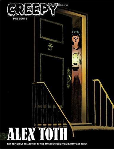
As a seasoned artist, I look at Alex Toth’s work and I am inevitably delighted. I have sat in awe of a story of no consequence of nothing more than a handful of pages because it was drawn by Toth, and it would be like no other – the compositions, the flow from panel to panel, the well-formed figures, the abstracted simplicity, and the way he put all this together. It was my idea, along with that of countless others, that Toth could not disappoint.

Creepy Presents: Alex Toth was a book I had to have and it is a book I will keep, even if it has the distinction of being the least impressive of Toth’s work. From the start, the drawings feel flimsier than anything else he’s done. As I was trying to understand why I felt this way, I found clues in the gray tones. He seems to struggle with the tones; it feels like he’s filling things in. I wasn’t sure. I kept looking into it. How was this possible?

The fundamental problem, as I gathered it, was that Toth was strongest in pure black and white, without tones, unless the tones were clean or mechanically placed. That simplicity he thrived on was sheer magic when he was in complete control of the art, including the lettering. All the work in this book is also without color, but the gray tones muddy that crisp clarity he brought into his simple, albeit sophisticated, forms. Either ink wash or pencil or gray marker (I can’t tell which), the techniques used here form a veneer of possibilities, yet they never go far enough. There are never more than one or two shades of gray, almost no textural differentiation, and the worst: the grays did nothing to heighten the forms or do anything else for that matter. It was grainy in parts, washed out in others, dark and opaque in still others. It felt as if he were rushed. The signature Toth drawing was there, but the forms were often faded by haphazard scumbles – obscured – undermining the clarity he looked for.

thestalkers4

What was the problem here? Was it the printing limitations of the original Warren magazines? No, not at all. Toth contemporaries working with the same array of tones produced many levels above this, using a rich range of grays, employing patterns to great effect, playing with lighting to direct the eye; just look at what Steve Ditko was doing at the same time for the same publications.

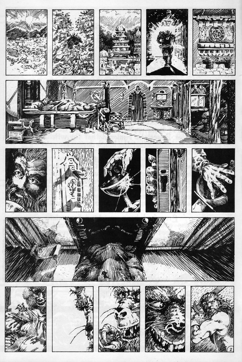
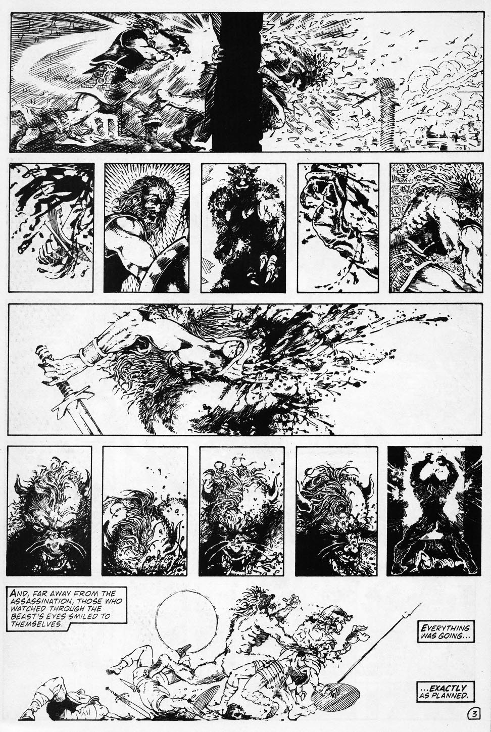
The stories in which the gray tones work best still come across as sketchy; I am thinking of “Survival,” where you can find backgrounds obviously influenced by Milton Caniff, one of Toth’s inspirations. The grays enhance here and there but feel almost like surplus work.  In “Proof Positive,” you get an inkling of more effective grays, but they’re still too blurry (perhaps done purposefully to satisfy the theme of photography in this story). At other times, like in the “Hacker” stories, the more concrete shades look divorced from the line work; it reminded me of talented student work. It makes me wonder if Alex Toth was in over his head with these techniques. Perhaps here was an area of drawing that the master himself had not yet mastered. Or maybe he rendered them too quickly; I found signs that betray that he tossed some of these tones together. (If you look at the page illustrated above, you’ll find a halo around every form in Panel Four, the kind of shortcut for which I reprimand my lazier students.) Unsurprisingly, the story with the strongest mark of Toth on it is one of the few without tones, titled “The Reaper.”

So, yes, the art did disappoint. But then again, we’re talking about expectations set by Toth himself. The book does not deliver because even when you scrutinize the panels and find that the foundational drawing is there, the results themselves – as a whole – fall apart.

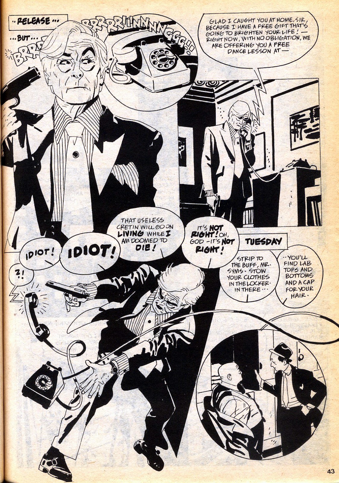
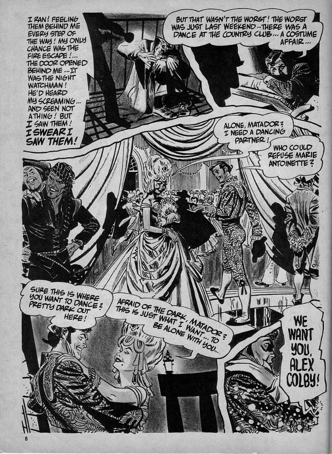
And the stories certainly don’t help. Most of them are scripted by Archie Goodwin, whose tales may start with a bit of snap or a strong mood, but continue with verbosity that does not read well today, and always end stale with contrived shock endings. The one exception is “The Reaper,” which had a nice rhythm to it that was in precise harmony with Toth’s panels. The stories by other writers run the same course, and word balloons pile on top of each other holding superfluous text, blotting out the art, tearing the reader’s attention from the what’s going on in the panels.

What was exciting for me about this book was the presence of four of Toth’s very own stories. One of Toth’s aspirations was that of doing his own scripting, of which he had few opportunities in his career. This book has four stories that fall completely under his creative control, from writing and lettering to penciling and inking. The stories are more of the same Twilight Zone fluff that for some reason necessitated a surprise in the end, but they are noteworthy because they are better than most of the others in the collection, and here the artist is the complete author of his work.

kui6

The book also includes several stories in which Toth is inking over somebody else’s pencils, and I was least interested in these pages. With the exception of a panel here and there, there was little Toth to be found in them.

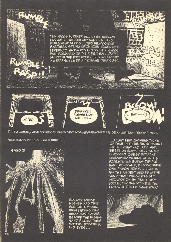
Ultimately, am I keeping the book? I have already said I would. Even with all the blemishes, there is still enough good quality inside, especially in the great storytelling techniques. I am thinking of stories like “Kui” (scripted by Toth), which showcases closeups of vegetation and temple walls – essentially abstract panels – heightening the sense of claustrophobia by limiting perspective (regardless if it were spotted with more of that ambiguous shading). I am also thinking of “Survival,” which is simply beautiful, even with that ridiculous surprise ending. Though not Toth’s greatest work, this collection still offers his brand of craft. Toth’s flawed work can still inspire awe.

tumblr_mzq0ytlwkz1rhjbado4_1280

Leave a comment | Categories: Comics | Tags: ,

Steve Rude: Artist in Motion

01 May 2015 by Rey Armenteros

The independent comics boom of the 1980s created new directions in comics storytelling. The art styles were basically the same, but the approaches to story seemed to gather what was already established in the mainstream and give it a couple of twists. On the surface, Nexus was a superhero comic set in outer space, but it was actually a complicated tale about the forces behind blind justice, and how the titular character wrestled with the need to execute the guilty with his inexorable powers. The stories by Mike Baron were compelling and more involved than the standard fair in most other comics. And the art of Steve “The Dude” Rude marked rare instances of elegance in the comics of those days.

AIMrg-2_large

Flesk Publications put out Steve Rude: Artist in Motion a few years ago. It covers instances of the Dude’s entire career, giving the reader a survey of all of his accomplishments. In this single volume, we get some knowledge on his influences from Alex Toth and Russ Manning, among many others. We get a detailed interview that sheds light on his approach and some of the high and low points of his career. We get a wide range of art, from comic books to paintings, from nude studies to animation stills.

The elements that gave me pause for reflection had to do with his untiring drive to learn more and more techniques. Here was a comics artist who was already extraordinarily accomplished in the 1980s with comic pages that were respected by industry professionals along with covers that had a panache for realism while still retaining the charm of fantasy. Indeed, in one chapter, he is favorably compared with Alex Ross, which is an apt connection. I would go so far as to say that the Dude paved the way for the likes of Alex Ross by doing painted covers grounded in all aspects of verisimilitude, using convincing proportions and established light sources.

Even though he was ever the innovator, Steve Rude was to this day still learning from his old painting teacher and striving to perfect his craft. It almost makes me pause once again – but in order to reflect in the other direction. As an artist, I understand all too well the obsession behind getting better and better, but I found that the exercises that he pursued in this venture were not as exciting as his comic book work, and it made me wonder why the publisher devoted whole chapters to it. Honestly, who cares about another nude study? We’ve seen millions of these, and when publishers include them in art books, it is almost as if to say, “yes, but he can also do this more serious stuff.” I don’t care for the Coke ads and the pastel portraits; there was nothing special about them – even the technique was inferior to many of his Nexus covers from the 1980s. Give me more of Nexus in costume, as real as the Dude could make him shooting beams of deadly light from his hands, and Behold!…There’s the real art in motion!

nexus_intro1078327

Leave a comment | Categories: Comics | Tags: ,

Questioning the Crowquill

08 November 2014 by Rey Armenteros

Dragon Lord

There is a connection between the last entry and the running thought so far. When you look at the Dragon Lord’s artwork, it shows the same kind of work I was doing then, even if mine lacked the professional polish. Here are a few of the pages I’m talking about. The second and third pages are incredible because they exhibit thirty panels that attempt a crosshatching treatment that actually works in most of the panels. Looking at it now, however, it doesn’t inspire like it once did. If you look long enough, individual panels do curl under sufficient scrutiny – a few of them are hard to read, and throughout the comic book, you won’t find a page without blemishes, such as clumsy forms or strange compositions.

Nevertheless, when I first opened that copy of The Reign of the Dragon Lord as a teenager, I couldn’t help feeling excitement and deflation simultaneously. Here was a published work that had closely mirrored the visual goals I had for my own work. As my young mind must have concluded when I put the comic down, it was a great idea that had already been done, and so I had to find something different. And that might even mean changing my ideals, because when you changed your style, as I must have been contemplating shortly after reading this comic book, you have to change some of the ideology that goes along with it.

In those days, I would deny old styles so fervently, that I hated the previous one as soon as I found a new one. After crosshatching for years, I was toying with alternatives. It may have been that I was already contemplating working in a brush before ever picking up Dragon Lord. But even so, the discovery of this comic would have cemented this search for new possibilities. For me, picking up a brush meant flirting with new strangers (no matter how clumsy the interaction), and that meant ultimately turning my back on the crowquill.

Dragon Lord_0001

Dragon Lord_0002(Copyright for images belong to their respective owners.)

Leave a comment | Categories: Comics

A Missing Comic Book

14 October 2014 by Rey Armenteros

Without ever going through the conscious decision of collecting them, I acquired about half of my comics one way or another. I can’t say I liked many of these comics that fell on my lap. If I ever got rid some of this variety of comic book, regret rarely followed. The Reign of the Dragon Lord #1 was a comic that I bought with a clutch of other throw-aways. I had never heard of it before I found it in a bargain bin at a tiny comic convention (or maybe it was a book fair). But Dragon Lord stood out from the others as soon as I went past the cover and took a look inside. It was B&W and done in an array of crosshatching uncommon in comics, immediately raising an affinity within me as it connected with my own comic book ideas. The story was of a different turn while paralleling general fantasy themes I was addressing in my own work. Whenever I recalled that one well-done unknown, it was with some sense of respect. Because of this, I never would have gotten rid of it, and it disturbed me to find out it was missing when I was going through my collection a couple of years back.

Who knows what happened to it? I may have lent it to a friend, or I could have mistakenly included it with the thousand or so comics I sold to partially finance my educational plans (with money I never received). All I know is that I wouldn’t have gotten rid of it. Soon after the discovery, I found it online and bought it along with the second issue. I got comfortable a couple days after Christmas and read them together, taking joy in how it all came together and finding the effort commendable, albeit not without flaws. It was the kind of thing that could be labeled a labor of love, far more interesting to me than a perfectly-crafted comic that had no soul beyond the drive of a corporate outlook. I looked online for more, but I found that Eternity Comics, the publisher, had cancelled the title before the third issue came out. It was a story that had no ending though there was apparently one that was intended for it.

When I looked into it further, I came across a novel with the same title, and looking even further found the novelist was the same person as the one who had done the script all those years ago. This novel had come out within recent years, and it seemed to take the same premise as the comic book. If it was the same story, it at least brought the story to some form of resolution, even if it were missing the essential aspect that brought the experience home for me: the art.

The author had a website, and I sent him a message through it, telling him about my story with the long-lost comic and how much I thought it was special – like nothing I had seen before in comics. I asked him if he ever finished the story, impllying to mean as a comic book. If I remember this correctly, this was December 31st. When he responded, it was just three hours before New Year’s (on the West Coast). After expressing his appreciation of my comments, he told me that he had recently written a novel that finalized the story he had in mind all those years back. Then he added that my comment had come at just the right time; he had had a terrible year and at least he was able to finish it on a good note with the warm thoughts of an old fan. He told me to check out the novel, that I wouldn’t be disappointed. I wrote back telling him I would, even though I knew I didn’t mean it. Somehow, as I thought of it then (and as I still think of it now), it wouldn’t have been the same.719457


733817

(Copyright for images belong to their respective owners.)


Leave a comment | Categories: Comics

Newer posts →