Steve Rude: Artist in Motion
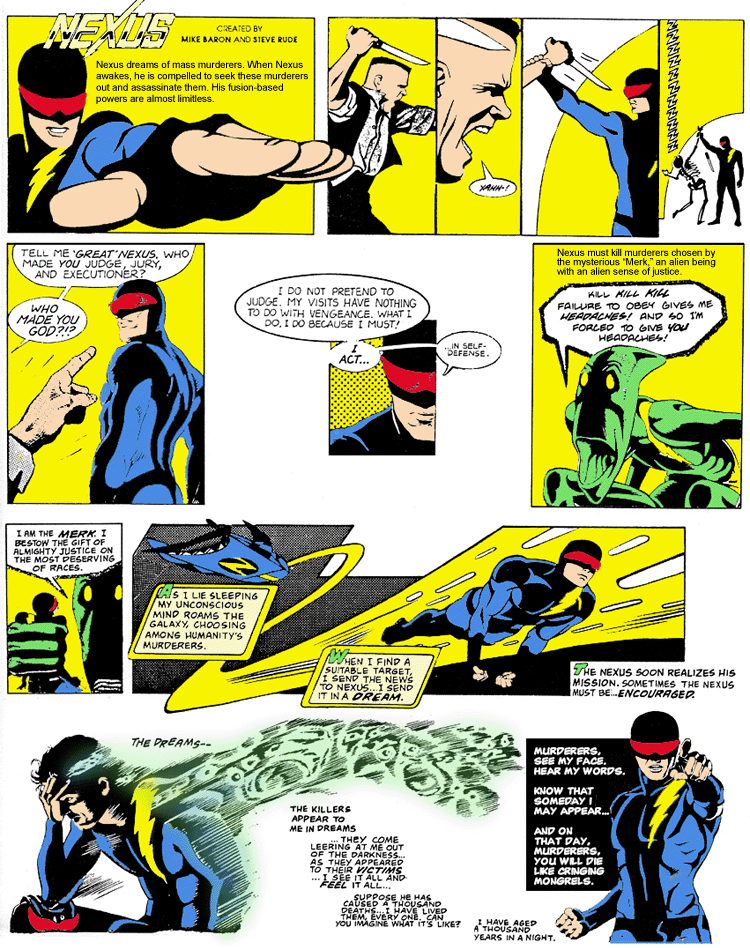
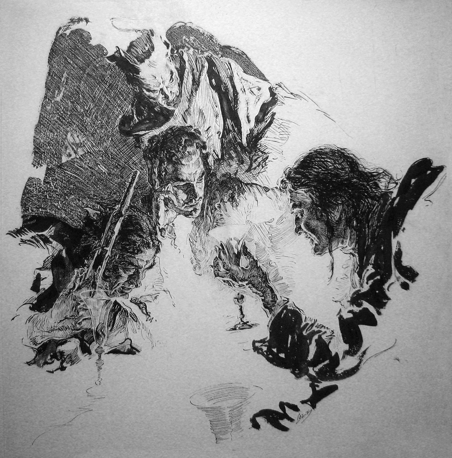
by Rey ArmenterosThe independent comics boom of the 1980s created new directions in comics storytelling. The art styles were basically the same, but the approaches to story seemed to gather what was already established in the mainstream and give it a couple of twists. On the surface, Nexus was a superhero comic set in outer space, but it was actually a complicated tale about the forces behind blind justice, and how the titular character wrestled with the need to execute the guilty with his inexorable powers. The stories by Mike Baron were compelling and more involved than the standard fair in most other comics. And the art of Steve “The Dude” Rude marked rare instances of elegance in the comics of those days.

Flesk Publications put out Steve Rude: Artist in Motion a few years ago. It covers instances of the Dude’s entire career, giving the reader a survey of all of his accomplishments. In this single volume, we get some knowledge on his influences from Alex Toth and Russ Manning, among many others. We get a detailed interview that sheds light on his approach and some of the high and low points of his career. We get a wide range of art, from comic books to paintings, from nude studies to animation stills.
The elements that gave me pause for reflection had to do with his untiring drive to learn more and more techniques. Here was a comics artist who was already extraordinarily accomplished in the 1980s with comic pages that were respected by industry professionals along with covers that had a panache for realism while still retaining the charm of fantasy. Indeed, in one chapter, he is favorably compared with Alex Ross, which is an apt connection. I would go so far as to say that the Dude paved the way for the likes of Alex Ross by doing painted covers grounded in all aspects of verisimilitude, using convincing proportions and established light sources.
Even though he was ever the innovator, Steve Rude was to this day still learning from his old painting teacher and striving to perfect his craft. It almost makes me pause once again – but in order to reflect in the other direction. As an artist, I understand all too well the obsession behind getting better and better, but I found that the exercises that he pursued in this venture were not as exciting as his comic book work, and it made me wonder why the publisher devoted whole chapters to it. Honestly, who cares about another nude study? We’ve seen millions of these, and when publishers include them in art books, it is almost as if to say, “yes, but he can also do this more serious stuff.” I don’t care for the Coke ads and the pastel portraits; there was nothing special about them – even the technique was inferior to many of his Nexus covers from the 1980s. Give me more of Nexus in costume, as real as the Dude could make him shooting beams of deadly light from his hands, and Behold!…There’s the real art in motion!