Moments with John Paul Leon – Fifth
In an earlier conversation about what were some of the qualitative elements that made some comics stand out, I remarked that I was not sure, since I had not been reading any in a long time. And he flinched, exclaiming that I was Mr. Comic Books — how could I say that?
I used to be, but I had long left it behind me. A large part of my return to comics as a loving pastime were my initial discussions with JP when we got back together to partake in this thing that drove us onward since our youth.
He reminded me that I was the one that got him into Batman Year One. He had dismissed it as a kid, because David Mazzucchelli’s art was too simple, and I brought it over one day to show him what it was all about. He said that because of me, he gave it another look and became a believer. When he was a student at SVA, he bought every issue of Mazzucchelli’s self-published magazine, Rubber Blanket. He let me borrow those rare magazines, and when I was about to move to LA, I told him that I still had his Rubber Blankets, and he told me it was okay that I could take them to California, that he would see me again one day.
In California, I would remind him I still had his Rubber Blankets. He said not to worry about it. A couple of years later, I told him I was going to Miami, and I asked him if he wanted to meet, that way I can return his Rubber Blankets, and he said, “Son-of-a-bitch! That’s where they’ve been!”
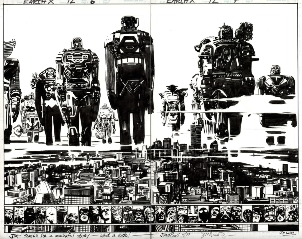
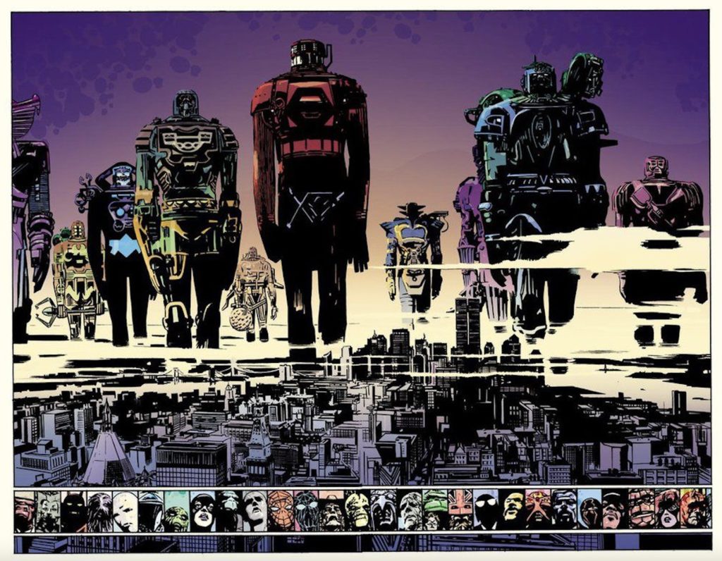
Well, I got him his Rubber Blankets back, and that time, I went with my brother, and we were talking about old times as JP kept brandishing book after book of great comic book artists, from Europe, from Argentina. He had ten copies of a super deluxe edition of his collaboration on Earth X. Each copy of the book was in a white box, along with mini-poster, DVD, and a plastic case that had what looked like an action figure fused on the cover. He gave one copy to me and one to Alex. I would flip through it soon afterward, and I found his art so beautiful in black and white. It was inked by Bill Reinhold, and I enjoyed how some of the flourishes were almost gray.
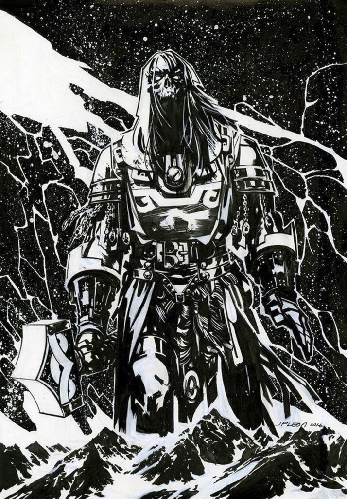
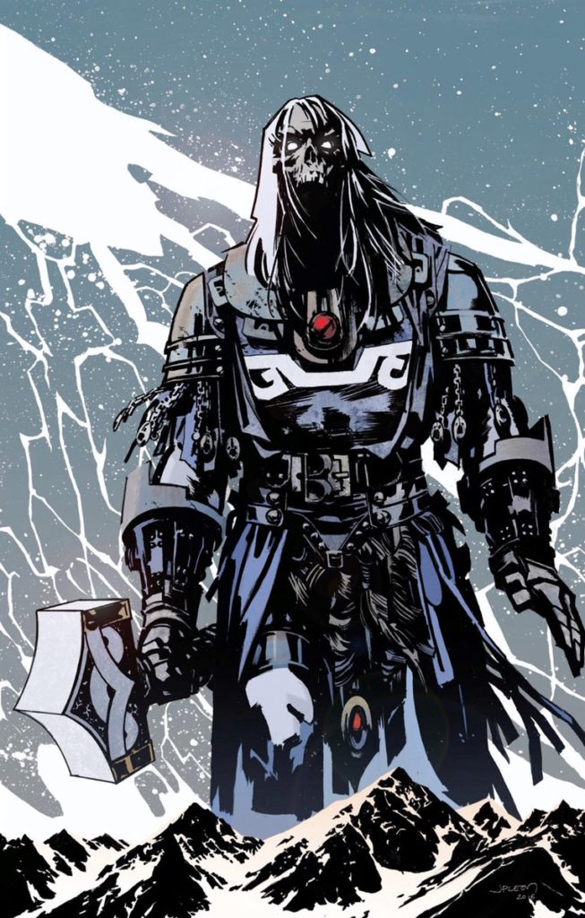
JP had always told me that his work looked best in black and white. I didn’t always agree. I think it depended on the colorist. His work had received coloring jobs at Marvel that effectively destroyed his work. Some colorists try to upstage the penciller, thinking it’s their game. A couple of times, the colorist on JP’s art had no technical experience with printing, over-saturating the color into these densely heated shapes that lost all form. I understood JP’s ideas. But I felt Winter Men, for one example among many, worked beautifully with his drawing, elaborating on what was alluded to in the original art.
I would think a lot about his thoughts about preferring black and white. I would look at the black-and-white work of other artists, and I would look at my own paintings when it had little or no color. I gave his perspective on the issue much thought. Was a line drawing better without color, and what made it so? I thought that such answers were only available on a case-by-case basis.
There was line art that screamed for the need for color, because it was in danger of remaining just a simple, flat image that would not draw in most people. But if there was a network of crosshatching, most such images needed to remain in black and white. Coloring such complex drawings was usually asking for trouble, unless it were done from a safe distance, such as with a very soft color palette.
If the work were like JP’s, where the naturalistic forms were delivered with elegant simplicity and punctuated with deep, inky areas, then it could go either way, I felt, but I usually wanted to see his work with some color. When colored, his work needed muted colors as opposed to intense ones. There were some independent cartoonists, like Jaime Hernandez, whose work stood strong in black and white, but which I always felt looked even better in color.
I felt that if you had a simple color distribution, even on a fairly elaborate drawing (just short of full crosshatching) it partitioned the areas with more clarity, giving the image as a whole more impact — but of course, only on the condition that the color harmonies did not detract from the whole.
When a drawing remained in black and white, the viewer had to actually “read” them; you had to look at the drawing longer to investigate the details that were giving you the pieces of the whole. It was about taking the time to look the drawing over and perhaps finding a few surprises while clarifying where the figures were and what the spaces were doing. It brought a longer element of time, which I was starting to conclude was interesting because it compelled the viewer to stay longer.
I deviate into these thoughts here because it was something I wanted to bounce off of JP, especially in this case because it had originated with his own thoughts. But it was one of those things that I never got the chance to mention to him. Our conversations were so rare that every time we got on the phone, I had so many things I wanted to tell him — so many other ideas. No, we didn’t get to talk as often as I would have liked, but when we did, we killed off entire nights going over that thing that fueled us most. He was the professional that worked with the highest set of standards, and I was the scrutinizing aficionado whose own paintings were heavily-influenced by comics.
He told me more than once that I was the only guy he would talk about these things to. I found it so hard to believe, because he was in the middle of the industry, and I said so. But he insisted, because when he talked to his colleagues about comics, it was more about the field, about pragmatic matters. And that made sense, because such is life. That is what we might fall into with our close peers, because every industry offers so many other challenges than the ones we predicted when we were first entering those fields.
What he appreciated about our talks was that it was his outlet to talk about those things that he loved in his medium. And we got very technical because we were both versed in the minutiae of craft, recognizing it and the way it affected the reading of a comic book.
I told him I could say the same about him. There was no one I knew that could talk on such a deep level about this. I had friends that knew comics, but when I started to talk, they would lose interest if I even so much as mentioned technique. There was no one else for me. I would sometimes have conversations with JP in my head until that next time that we could carve out the time for our long telephone bouts about art.
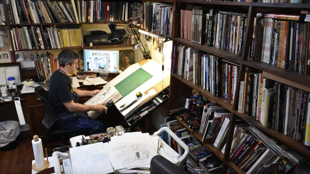
There he was in black and white, and then when we finally get to read JP’s work, it’s in color. I am now thinking about the complete stack of Winter Men pages he had in his studio — I think it was during that time after the artwork was shipped back to him. It was during one of my rare visits to his studio, and he was showing me the stack of all the original art. That was where the black and white conversation had started, and it would continue in other talks about it, culminating with me in my years-long contemplation of such matters.
He was patting the stack and saying, “I think the art looks better in black and white.” And you know — before returning to painting, I too was solely a black and white artist for enough years to appreciate that sentiment, even though in those days when this took place, I was getting inebriated off the colors I was manifesting in my studio.
He added a throw away comment about how he felt that he never wanted to make the original pages into anything precious. They were tools that were to be handled and tossed around in front of scanners or cameras. I understand that too; it was the warm feeling of a worn book versus the stiff hardcover that cracks when you open it for the first time. That was the difference between page originals and a pastel drawing carefully preserved behind the glass of a frame.
Black and white or not, JP eventually got into coloring his own comic books. He told me once that he was looking at the way the colorist did the job on Winter Men — studying it! — because that colorist did a really good job with his work. When JP was later doing those many covers for various titles at every major comic book company, it was JP himself coloring them. Though not a great lover of working color, he was quite good, looking at colorists, sometimes mentioning names I didn’t think he knew because it was from comics I knew were outside his circle of interest. There was Kristian Donaldson, who did Supermarket, and I was taken aback a little, because that guy’s colors would get strong.
I was still wrestling with what I wanted out of color. Color could take years to work out before you arrived at something, and I was telling that to my wife during one of those times when I was going on about craft in drawing and painting. All she could say was that even though she liked my new work, she always loved my ink wash work best because it was in black and white.
